
In order to promote public education and public safety, equal justice for all, a better informed citizenry, the rule of law, world trade and world peace, this legal document is hereby made available on a noncommercial basis, as it is the right of all humans to know and speak the laws that govern them.
“SUPERSEDED BY LATER ISSUE”
USAS
Z35.1-1968
Revision of Z35.1-1959
SUPERSEDED
USA Standard
Specifications for Accident Prevention Signs
“SUPERSEDED BY LATER ISSUE”
20
003am
35.1–1968
USAS
Z35.1-1968
Revision of Z35.1-1959
Sponsor
National Safety Council
Approved September 18, 1968
United States of America Standards Institute
A USA Standard implies a consensus of those substantially concerned with its scope and provisions. A USA Standard is intended as a guide to aid the manufacturer, the consumer, and the general public. The existence of a USA Standard does not in any respect preclude anyone, whether he has approved the standard or not, from manufacturing, marketing, purchasing, or using products, processes, or procedures not conforming to the standard. USA Standards are subject to periodic review and users are cautioned to obtain the latest editions. Producers of goods made in conformity with a USA Standard are encouraged to state on their own responsibility in advertising, promotion material, or on tags or labels, that the goods are produced in conformity with particular USA Standards.
Published by
United States of America Standards Institute
____________
No portion of this publication may be quoted or reproduced in any form without the written permission of the United States of America Standards Institute.
Printed in USA
A5M1268/250
3(This Foreword is not a part of USA Standard Specifications for Accident Prevention Signs, Z35.1-1968.)
These specifications were formulated according to the procedure of the USA Standards Institute under the administrative leadership of the National Safety Council, and with the following scope:
Design, application, and use of warning signs or symbols (other than slogans) indended to indicate and, in so far as possible, to define specific hazards of a nature such that failure to so designate them may cause, or tend to cause accidental injury to workers, or the public, or both.
Suggestions for improvement gained in the use of this standard will be welcomed. They should be sent to the United States of America Standards Institute.
USA Standards Committee Z35 consisted of the following personnel at the time action was taken on this standard:
L. W. Hagerup, Chairman T. F. Bresnahan, Secretary
| Organization Represented | Name of Representative |
|---|---|
| American Federation of Labor & Congress of Industrial Organizations | (Representation Vacant) |
| American Mutual Insurance Alliance | C. Dewey F. H. Deeg (Alt) |
| American Insurance Association | W. C. Trimmer J. Gillice (Alt) |
| American Society of Safety Engineers | C. E. Peitscher A. P. Chiappa (Alt) |
| Associated General Contractors of America | F. M. Livingston, Jr A. L. Schmuhl (Alt) |
| Association of American Railroads | H. E. Shaughnessy |
| Building Constructors Employers Association | H. McRae |
| Eastern Metal of Elmira, Inc | B. M. Names |
| Electric Light and Power Group | D. R. Poole A. T. Higgins (Alt) |
| Industrial Accident Prevention Associations (Liaison) | R. G. Anderson S. G. Twist (Alt) |
| Industrial Safety Equipment Association | J. S. Adkins C. N. Sumwalt, Jr (Alt) |
| International Association of Governmental Labor Officials | J. F. Nimick T. A. Oravecz H. G. Lacey (Alt) W. McCoy (Alt) |
| Minnesota Mining & Manufacturing Company | G. B. Caples L. Solyntjes (Alt) |
| National Safety Council | L. W. Hagerup T. F. Bresnahan (Alt) |
| Tag & Label Manufacturers Institute | W. C. Webster |
| Telephone Group | V. J. Meyers J. R. Langwig (Alt) |
| U. S. Department of Labor, Bureau of Labor Standards | G. Yatsko P. Cestrone (Alt) |
| SECTION | PAGE | |
|---|---|---|
| Introduction | 7 | |
| 1. Scope, Purpose, and Effective Date | 7 | |
| 2. Definitions | 7 | |
| 3. References to Other Codes | 8 | |
| 4. Classification of Signs According to Use | 8 | |
| 4.1 Danger Signs | 8 | |
| 4.2 Caution Signs | 8 | |
| 4.3 Safety Instruction Signs | 8 | |
| 4.4 Directional Signs | 8 | |
| 4.5 Informational Signs | 8 | |
| 5. Sign Design and Colors | 8 | |
| 5.1 Sign Finish | 8 | |
| 5.2 Design Features | 8 | |
| 5.3 Danger Signs | 9 | |
| 5.4 Radiation Warning Signs | 9 | |
| 5.5 Caution Signs | 10 | |
| 5.6 Exit Signs | 10 | |
| 5.7 Safety Instruction Signs | 10 | |
| 5.8 Directional Signs | 10 | |
| 5.9 In-Plant Traffic Signs | 12 | |
| 5.10 Informational Signs | 12 | |
| 5.11 Slow Moving Vehicle Emblem | 12 | |
| 6. Sign Wordings | 12 | |
| 6.1 Examples of Wordings | 12 | |
| 6.2 Nature of Wording | 12 | |
| 6.3 Danger Signs | 12 | |
| 6.4 Biological Hazard Signs | 13 | |
| 6.5 Caution Signs | 13 | |
| 6.6 Safety Instruction Signs | 13 | |
| 6.7 Directional Signs | 13 | |
| 6.8 Informational Signs | 14 | |
| 7. Sign Lettering | 14 | |
| 7.1 Balance and Legibility | 14 | |
| 7.2 Type of Lettering | 14 | |
| 7.3 Wording and Space | 14 | |
| 7.4 Layout | 14 | |
| 7.5 Examples | 14 | |
| 8. Sign Construction, Materials, and Finishes | 15 | |
| 9. Revision of USA Standards Referred to in This Document | 15 | |
| Tables | ||
| Table 1 Standard Proportions for Danger Signs | 9 | |
| Table 2 Standard Proportions for Caution Signs | 10 | |
| Table 3 Standard Proportions for Safety Instruction Signs | 11 | |
| Table 4 Standard Proportions for Directional Signs | 11 5 | |
| Figures | ||
| Fig. 1 Danger Sign | 9 | |
| Fig. 2 Radiation Warning Sign | 9 | |
| Fig. 3 Standard Radiation Symbol | 9 | |
| Fig. 4 Caution Sign | 10 | |
| Fig. 5 Safety Instruction Signs | 10 | |
| Fig. 6 Directional Signs | 10 | |
| Fig. 7 Slow-Moving Vehicle Emblem | 12 | |
| Fig. 8 Symbols Used on Signs | 12 | |
| Fig. 9 Symbol for Biological Hazard | 13 | |
| Fig. 10 Example of Incorrect Sign Lettering | 14 | |
| Fig. 11 Example of Correct Sign Lettering | 14 | |
USA Standard
Specifications for Accident Prevention Signs
Accident prevention signs are probably one of the oldest items of safety equipment used. It will never be known how many eyes, lives, or buildings have been saved because a reminder in the form of a sign warning employees to “Wear Goggles,” “Watch Out for Trucks,” or “Do Not Smoke—Flammable Liquids—Stored in This Area” have been mounted in appropriate areas.
Uniformity of signs, intelligently located and properly worded, should provide automatic warning, caution, or notice to all employees no matter where they work with a meaning that is clearly understood immediately.
Hazards should be eliminated wherever possible, but if they can’t be eliminated the employee should be informed of the hazard by signs posted as reminders.
The movement of pedestrians, cars, trucks, freight trains, etc, both on and off the plant, shows a definite need for standardization of signs. The same signs used in both places reduces confusion and moves traffic more rapidly and with less confusion.
1.1 Scope. These specifications apply to design, application, and use of signs or symbols (as included in Sections 4 to 7, inclusive) intended to indicate and, in so far as possible, to define specific hazards of a nature such that failure to designate them may lead to accidental injury to workers or the public, or both, or property damage.
These specifications are intended to cover all safety signs except those designed for streets, highways, railroads, and marine regulations.1 These specifications do not apply to plant bulletin boards or to safety posters.
1.2 Purpose. The purpose of these specifications is to eliminate as far as possible the indiscriminate posting of haphazardly selected signs and to install signs of certain designs for definite purposes.
1.3 Effective Date. It is not intended that all accident prevention signs in use at the time of approval of these specifications be replaced immediately with standard signs. All new signs and replacements of old signs should be designed and constructed in accordance with these specifications.
2.1 The word “sign” as used in these specifications refers to a surface on which letters or other markings appear, prepared for the warning of or safety instructions of industrial workers or members of the public who may be exposed to the hazards or regulations of industrial operations. Excluded from this definition, however, are news releases, or displays commonly known as safety posters or bulletins used for employee education. (Such posters or bulletins, however, should not be in violation of the principles of these specifications.)
2.2 The word “shall” is to be understood as mandatory.
2.3 The word “should is to be understood as advisory.
2.4 The word “approved” means approval by the authority having jurisdiction.
These specifications are supplemented by the following standards:
USA Standard Manual on Uniform Traffic Control Devices for Streets and Highways, D6.1-1961
USA Standard Safety Color Code for Marking Physical Hazards and the Identification of Certain Equipment, Z53.1-1967
1For signs pertaining to railroad and marine regulations, reference should be made to the Interstate Commerce Commission and the U.S. Coast Guard, Washington, D.C.
7National Fire Protection Association Code for Safety to Life from Fire in Buildings and Structures, NFPA No. 101-1967
4.1 Danger Signs
4.1.1 Danger signs should be used only where an immediate hazard exists. There shall be no variation in the type of design of signs posted to warn of specific dangers and radiation hazards.
4.1.2 All employees shall be instructed that danger signs indicate immediate danger and that special precautions are necessary.
4.2 Caution Signs
4.2.1 Caution signs shall be used only to warn against potential hazards or to caution against unsafe practices.
4.2.2 All employees shall be instructed that caution signs indicate a possible hazard against which proper precaution should be taken.
4.3 Safety Instruction Signs. Safety instruction signs shall be used where there is a need for general instructions and suggestions relative to safety measures.
4.4 Directional Signs. Directional signs in sufficient number should be used to indicate the way to locations such as exits, fire escapes stairways, and first-aid rooms.
Exit doors and passageways shall have signs visible from the exit approach indicating the way of egress. For auditoriums or other places of public assembly accommodating 200 persons or more there shall be placed over each door or doorway to be used for egress a sign with the word “Exit” in plainly legible letters not less than 6 inches high and with principal strokes of such letters not less than ¾ inch in width. All other places, where so required by the several occupancy sections, shall have each exit door or exit way marked by signs with plainly legible letters not less than 6 inches high or by internally illuminated signs with letters not less than 4½ inches high. Signs in corridors and other passageways, where necessary to indicate the direction of egress shall have the words “To Exit” with a suitable pointer or arrow indicating the way. The lettering shall be of sizes not smaller than required for the exit signs.
Exit signs shall be over doors or exitways and shall be suitably illuminated by a reliable light source giving an intensity of not less than 5 footcandles on the illuminated surface. Such illumination shall be continuous as required for exit ways. Except where otherwise required by law or ordinance, exit signs shall have white letters on a red field or, for the internally illuminated types, shall have red letters of translucent material in an opaque field. Artificial lights giving illumination to exit signs other than the internally illuminated types shall have screens, discs, or lenses of not less than 25 square inches area made of translucent material to show red on the side of the approach.
NOTE: Except where otherwise required by law or other compelling circumstance, the light source should give a white light for the better illumination of the sign and the vicinity of the exit door.
Exit signs, where electrically lighted, shall be connected with an independent lighting source.
4.5 Informational Signs. Informational signs should be used where it is advisable to convey general information, on subjects not necessarily of a safety nature, in order to avoid confusion and misunderstandings. Signs such as those which mark toilets, offices, entrances, and locker rooms fall in this classification.
5.1 Sign Finish. The decision to use reflectorizing materials, fluorescent coatings, paint backed enamel, or porcelain enamel for the sign finish should be made after careful consideration of such factors as the purpose of the sign, normal visibility requirements visibility requirements during emergencies such as fire or power failure; the deleterious elements which the sign is subjected to and the desired life of the sign. Artificial illumination may be used to increase the effectiveness of certain signs.
5.2 Design Features. The colors, proportions, and location of the identification panels on each sign indicated in the following sections shall be regarded as standard. All signs shall be furnished with rounded or blunt corners and shall be free from sharp edges, burrs, splinters, or other sharp projections. The ends
8| Sign Size, Inches Height Width |
Black Rectangular Panel, Inches Height Width |
Red Oval, Inches Height Width |
Word Danger, Height Inches |
Maximum Space Available for Sign Wording, Inches |
|---|---|---|---|---|
| HORIZONTAL PATTERN | ||||
| 7 × 10 | 3¼ × 9⅜ | 2⅞ × 8½ |  |
2¾ × 9⅜ |
| 10 × 14 | 4⅝ × 13⅜ | 4⅛ × 11⅞ |  |
4¼ × 13⅜ |
| 14 × 20 | 6½ × 19⅜ | 5¾ × 17 | 2⅞ | 6¼ × 19⅜ |
| 20 × 28 | 9¼ × 27⅜ | 8¼ × 23⅞ | 4⅛ | 9½ × 27⅜ |
| UPRIGHT PATTERN | ||||
| 10 × 7 | 2⅜ × 6⅜ | 2⅛ × 5⅞ |  |
6⅜ × 6⅜ |
| 14 × 10 | 3¼ × 9⅜ | 2⅞ × 8½ |  |
9½ × 9⅜ |
| 20 × 14 | 4⅝ × 13⅜ | 4⅛ × 11⅞ |  |
14 × 13⅜ |
| 28 × 20 | 6½ × 19⅜ | 5¾ × 17 | 2⅞ | 20¼ × 19⅜ |
or heads of bolts or other fastening devices shall be located in such a way that they do not constitute a hazard. When conditions warrant the use of a sign size not covered in these tables, the ratio of the depth of the identifying panel (Danger, Caution, etc) to the width of the sign shall be as established in Tables 1.4.
5.3 Danger Signs
5.3.1 Standard Colors and Specifications. (See Fig. 1.) The colors red, black, and white shall be those of opaque glossy samples as specified in Table 1, Fundamental Specification of Safety Colors for CIE Standard Source “C,” USA Standard Z53.1-1967.
5.3.2 Standard Proportions. (See Table 1.)
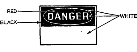
Fig. 1 Danger Sign
5.4 Radiation Warning Signs
5.4.1 Standard Colors. (See Fig. 2.) The background shall be yellow; the panel, reddish purple with yellow letters; the symbol, reddish purple. Any letters used against the yellow background shall be black. The colors shall be those of opaque glossy samples as specified in Table 1 of USA Standard Z53.1-1967.
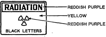
Fig. 2 Radiation Warning Sign
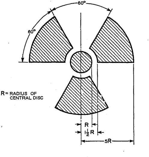
Fig. 3 Standard Radiation Symbol
95.4.2 Standard Symbol. (See Fig. 3.) Method of dimensioning, design, and orientation of the standard symbol (one blade pointed downward and centered on the vertical axis) shall be executed as illustrated. The symbol shall be prominently displayed, and of a size consistent with the size of the equipment or material or area to which it is attached.
5.4.3 Standard Proportions. Sign proportions shall be the same as those recommended for danger signs (see Table 1).
5.5 Caution Signs
5.5.1 Standard Colors and Specifications. (See Fig. 4). The background shall be yellow; and the panel, black with yellow letters. Any letters used against the yellow background shall be black. The colors shall be those of opaque glossy samples as specified in Table 1 of USA Standard Z53.1-1967.
5.5.2 Standard Proportions. (See Table 2.)
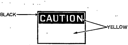
Fig. 4 Caution Sign
| Sign Size Inches Height Width | Black Rectangular Panel, Inches Height Width | Word “Caution” Height of Letter, Inches | Max Space Available for Sign Wording Below Panel, Inches Height Width |
|---|---|---|---|
| HORIZONTAL PATTERN | |||
| 7 × 10 | 2¼ × 9⅜ | 1⅝ | 3¼ × 9⅜ |
| 10 × 14 | 3¼ × 13⅜ | 2¼ | 5½ × 13⅜ |
| 14 × 20 | 3¾ × 19⅜ | 2¾ | 9 × 19⅜ |
| 20 × 28 | 4¼ × 27⅜ | 3¼ | 14½ × 27⅜ |
| UPRIGHT PATTERN | |||
| 10 × 7 | 1⅝ × 6⅜ | 1⅛ | 7 × 6⅜ |
| 14 × 10 | 2¼ × 9⅜ | 1⅝ | 10½ × 9⅜ |
| 20 × 14 | 3¼ × 13⅜ | 2¼ | 15½ × 13⅜ |
| 28 × 20 | 3¾ × 19⅜ | 2¾ | 24 × 19⅜ |
5.6 Exit Signs. Exit signs shall conform to 4.4, which, in brief, requires that “Exit” be written in plainly legible red letters, not less than 6 inches high, on a white field, the principal strokes of such letters to be not less than ¾ inch in width.
5.7 Safety Instruction Signs
5.7.1 Standard Colors and Specifications. (See Fig. 5.) The background shall be white; and the panel, green with white letters. Any letters used against the white background shall be black. The colors shall be those of opaque glossy samples as specified in Table 1 of USA Standard Z53.1-1967.
5.7.2 Standard Proportions. (See Table 3.)
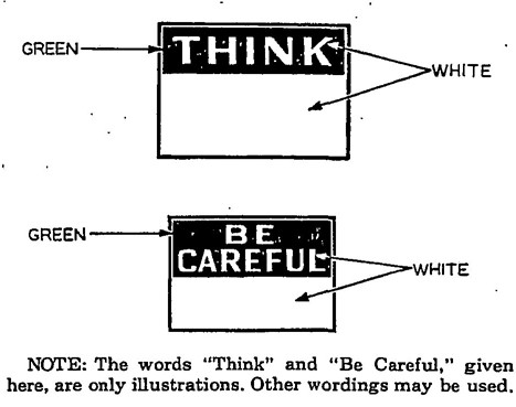
Fig. 5 Safety Instruction Signs
5.8 Directional Signs
5.8.1 Standard Colors and Specifications. The background shall be white; and the panel, black with white directional symbol. Any letters used against the white background shall be black. The colors shall be those of opaque glossy samples as specified in Table 1 of USA Standard Z53.1-1967.
5.8.2 Standard Proportions. (See Table 4.)
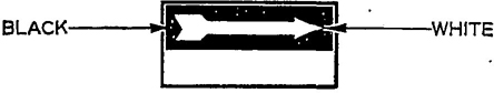
Fig. 6 Directional Signs
10| Sign Size, Inches Height Width | Green Rectangular Panel, Inches Height Width | Word “Think” Height of Letters, Inches | Max Space Available for Sign Wording Below Panel, Inches Height Width | Sign Size, Inches Height Width | Green Panel, Inches Height Width | Word “Be” Height of Letters, Inches | Word “Careful” Height of Letters, Inches | Max Space Available for Sign Wording Below Panel, Inches Height Width |
|---|---|---|---|---|---|---|---|---|
| 7 × 10 |  × 9⅜ × 9⅜ |
1⅝ | 3½ × 9⅜ | 7 × 10 | 3⅜ × 9⅜ | 1¼ |  |
2½ × 9⅜ |
| 10 × 14 | 3¼ × 13⅜ | 2¼ | 5½ × 13⅜ | 10 × 14 | 4¾ × 13⅜ | 1¾ |  |
4 × 13⅜ |
| 14 × 20 | 3¾ × 19⅜ | 2¾ | 9 × 19⅜ | 14 × 20 | 6¾ × 19⅜ | 2½ | 3⅛ | 6 × 19⅜ |
| 20 × 28 | 4¼ × 27⅜ | 3¼ | 14½ × 27⅜ | 20 × 28 | 9½ × 27⅜ | 3½ | 4⅜ | 9¼ × 27⅜ |
| Sign Size, Inches Height Width | Black Rectangular Panel, Inches Height Width | White Arrow, Inches | Maximum Space for Sign Wording Below Panel Height | |||
|---|---|---|---|---|---|---|
| Over-all Length | Arrow Head Height Width | Arrow Shaft Height | Arrow Tail Height Width | |||
| 6½ × 14 | 3¼ × 13⅜ | 12⅝ | 2¾ × 3 | 1⅛ | 2⅜ × 3¼ | 2¼ × 13⅜ |
| 9 × 20 | 4½ × 19⅜ | 18⅝ | 3¾ × 4⅛ | 1⅝ | 3¼ × 4½ | 3⅜ × 19⅜ |
| 12 × 28 | 6 × 27⅜ | 26⅝ | 5⅛ × 5⅝ | 2⅛ | 4⅜ × 6 | 4¾ × 27⅜ |
| 15 × 36 | 7½ × 35⅜ | 34⅝ | 6⅜ × 6⅞ | 2⅝ | 5½ × 7½ | 6¼ × 35⅜ |
5.9 In-Plant Traffic Signs. Regulatory and control signs required for the safe movement of vehicles and pedestrians on thoroughfares on plant property shall conform to the standards established in USA Standard D6.1-1961. A manual entitled Standard Highway Signs, which specifies the dimensions and layout of the signs mentioned in the first publication, was prepared by the Bureau of Public Roads in 1950 and reprinted in 1953.
5.10 Informational Signs. Blue shall be the standard color for informational signs. It may be used as the background color for the complete sign or as a panel at the top of such types of “Notice” signs, which have a white background. The colors shall be those of opaque glossy samples as specified in Table 1 of USA Standard Z53.1-1967.
5.11 Slow-Moving Vehicle Emblem. This emblem (see Fig. 7) consists of a fluorescent yellow-orange triangle with a dark red reflective border. The yellow-orange fluorescent triangle is a highly visible color for daylight exposure. The reflective border defines the shape of the fluorescent color in daylight and creates a hollow red triangle in the path of motor vehicle headlights at night.
The emblem is intended as a unique identification for, and it shall be used only on, vehicles which by design move slowly (25 mph or less) on the public roads. The emblem is not a clearance marker for wide machinery nor is it intended to replace required lighting or marking of slow-moving vehicles.
Neither the color film pattern and its dimensions nor the backing shall be altered to permit use of advertising or other markings.
(For further information on material, location, mounting, etc, refer to American Society of Agricultural Engineers Emblem for Identifying Slow-Moving Vehicles, ASAE R276, 1967.)
5.12 Symbols. Symbols used on signs shall follow recognized practices, such as in Fig. 8.
For radioactive materials, see symbol in Fig. 3.
6.1 Examples of Wordings. The lists in 6.3 through 6.7 are intended to serve as a guide for choosing the correct sign design for the message to be displayed. (See the paragraphs on design and proportions of signs in Section 5.)
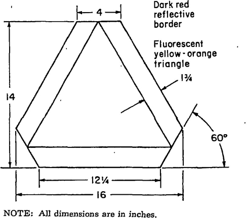
NOTE: All dimensions are in inches.
Fig. 7 Slow-Moving Vehicle Emblem
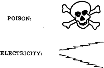
Fig. 8 Symbols Used on Signs
6.2 Nature of Wording. The wording of any sign should be easily read and concise. The sign should contain sufficient information to be easily understood. The wording should make a positive, rather than a negative suggestion, and should be accurate in fact.
6.3 Danger Signs
Danger—Keep Off, Electric Current
Danger—No Smoking, Matches, or Open Lights
Danger—Men Working Above
Danger—Not Room Enough Here to Clear Men on Cars
Danger—Keep Away
Danger—Men in Boiler
Danger—Insufficient Clearance
Danger—2,300 Volts
Danger—Keep Out
Danger—Crane Overhead
Danger—Keep Off
6.4 Biological Hazard Signs. The biological hazard warning shall be used to signify the actual or potential presence of a biohazard and to identify equipment, containers, rooms, materials, experimental animals, or combinations thereof, which contain or are contaminated with viable hazardous agents.
For the purpose of this standard the term “biological hazard,” or biohazard, shall include only those infectious agents presenting a risk or potential risk to the well-being of man.
The biohazard symbol for signifying biological hazard as defined in the scope of this standard shall be designed and proportioned as illustrated in Fig. 9.
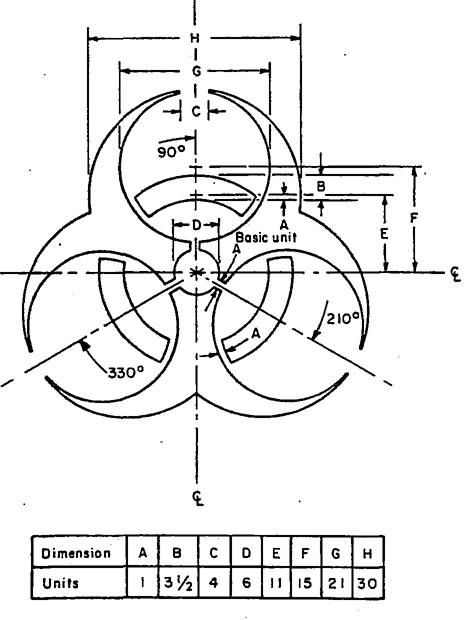
Fig. 9 Symbol for Biological Hazard
The symbol design shall be a fluorescent orange or orange-red color. Background color is optional as long as there is sufficient contrast for the symbol to be clearly defined.
Appropriate wording may be used in association with the symbol to indicate the nature or identity of the hazard, name of individual responsible for its control, precautionary information, etc, but never should this information be superimposed on the symbol.
6.5 Caution Signs
Caution—Do Not Operate, Men Working on Repairs
Caution—Hands Off Switch, Men Working on Line
Caution—Working on Machines, Do Not Start
Caution—Goggles Must Be Worn When Operating This Machine
Caution—This Door Must be Kept Closed
Caution—Electric Trucks, Go Slow
Caution—This Space Must Be Kept Clear at All Times
Caution—Stop Machinery to Clean, Oil, or Repair
Caution—Keep Aisles Clear
Caution—Operators of This Machine Shall Wear Snug Fitting Clothing—No Gloves
Caution—Close Clearance
Caution—Watch Your Step
Caution—Electric Fence
6.6 Safety Instruction Signs
Report All Injuries to the First-Aid Room at Once
Walk—Don't Run
Report All Injuries No Matter How Slight Think, if Safe Go Ahead
Make Your Work Place Safe Before Starting the Job
Report All Unsafe Conditions to Your Foreman
Help Keep This Plant Safe and Clean
6.7 Directional Signs
This Way Out (below arrow panel)
This Way (inside arrow) Out (below arrow panel)
Fire Exit (below arrow panel)
Fire (inside arrow) Extinguisher (below arrow panel)
To the (inside arrow) Fire Escape (below arrow panel)
To the (inside arrow) First Aid (below arrow panel)
Manway (below arrow panel)
This Way to (inside arrow) First-Aid Room (below arrow panel)
6.8 Informational Signs
No Trespassing Under Penalty of the Law
This Elevator Is for Freight Only, Not for Passengers
No Admittance Except to Employees on Duty
No Admittance
No Admittance, Apply at Office
No Trespassing
Men
Women
For Employees Only
Office
NOTE: When sign wordings such as those listed in this section are contemplated, care should be taken to be sure that they are suitable for the particular location at which the sign is to be placed and that wording meets the requirements of the intended purpose. When there is a reasonable doubt, a sign of a standard design should be used.
7.1 Balance and Legibility. The size of lettering to be used for the wording of the sign or message should be as large as possible but consistent with good balance and legibility.
7.2 Type of Lettering. Block-style lettering should be used because it is more easily read and requires less variance in eye efficiency for the different letters in the alphabet than most other types of letter faces.

Fig. 10 Example of Incorrect Sign Lettering

Fig. 11 Example of Correct Sign Lettering
7.3 Wording and Space. Letter sizes will necessarily depend upon the amount of wording and the amount of space available for the sign message. The following table shows the distances at which well-proportioned letters of different heights can be read by persons of normal vision, under good lighting conditions:
| Height of Letters, Inches | Distance Visible,* Feet |
|---|---|
| 3½ | 200-210 |
| 3 | 170-180 |
| 2½ | 140-150 |
| 2 | 110-120 |
| 1¾ | 95-105 |
| 1½ | 80-90 |
| 1¼ | 70-80 |
| 1 | 60-65 |
| ⅞ | 50-55 |
| ¾ | 40-45 |
| ⅝ | 30-35 |
| ½ | 20-20 |
| ⅜ | 20-25 |
| ¼ | 15-20 |
| *Distances specified do not include any allowance for various color combinations. | |
7.4 Layout. It is impossible to provide definite recommendations for laying out the letters contained in a sign message to produce the best possible sign from the standpoint of visibility and legibility. There are too many exceptions that can be considered only at the time the sign is being prepared. However, there are lettering manuals available that will assist in the forming of well-proportioned letters.
7.5 Examples. Figs. 10 and 11 show how letters appear when correctly and incorrectly formed and spaced. Fig. 10 shows letters all the same height and width and with the same spacing between the letters. Fig. 11 shows letters formed and spaced in accordance with the preceding suggestions.
In Fig. 10, note the small opening in the letter “A,” also how the letters “F,” “E,” and “N” appear larger than the other letters and how the letters “A” and “Y” appear smaller, although all letters are the same width.
Notice how some of the letters in Fig. 10 appear to be greatly separated from the other letters although the spacing between all letters is the same.
14In Fig. 11, note how all letters appear to be the same size although they are not; also, how the spacing appears to be uniform.
8.1 Many sign manufacturers carry a large variety of sign materials and finishes to cover practically all situations the sign buyer may require. The manufacturer can recommend the proper material when the location, exposure to the elements, etc, are known.
Steel and aluminum are two very popular materials for signs and both may have enamel or a painted surface with either embossed or painted messages. Fiber glass and a large variety of plastic materials are also available.
Usually the signs that are available in the sign manufacturers’ catalogs are properly constructed with regard to weight, thickness, or materials, and ability to withstand weather.
8.2 The selection of locations and positions of signs is important. A sign posted to carry the required information should be so located that it is legible to all concerned, but it should create no distractions.
Signs should be placed sufficiently ahead of a particular hazard to allow anyone coming in view of the sign to have ample time to heed the warning before encountering the hazard. This distance will vary from one hazard to another.
All signs should be so located as to not create a hazard in themselves. Signs in most cases should not be placed on movable objects such as doors, windows, racks, etc, because a change in position would void the purpose of the sign.
When natural light is insufficient, artificial light should be supplied. Glare on signs should be avoided.
When the following USA Standards referred to in this document are superseded by a revision approved by the USA Standards Institute, the revision shall apply:
USA Standard Manual on Uniform Traffic Control Devices for Streets and Highways, D6.1-1961
USA Standard Safety Color Code for Marking Physical Hazards and the Identification of Certain Equipment, Z53.1-1967
15 16 17 18 19